
When Graphic Designers Stick Bees in their Geometric Posters
The Juxtaposition of the Natural and Man-Made Elements

World-renowned designer Chris Do, along with his colleague Greg Gunn, and former colleague Matthew Encina have said that dynamic design is about creating contrasts between elements: color, weight, size, proximity, etc.
They’re right of course, and they’ve made this clear in the designs they’ve produced. I’d like to add something to that list of contrasts.
Something that’s stuck out to me for the past several years is the contrast between nature and technology; the asymmetrical vs the symmetrical. A graphic that is heavy with san-serif typography and sharp, geometric shapes can be intriguing with a well-placed bumblebee in the corner.
Sounds specific, I know, but take a look below at this poster by German graphic design studio Lamm & Kirch:
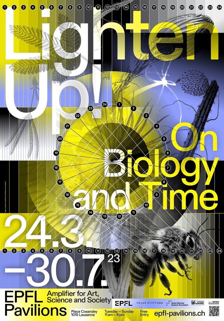
After a closer look, one also sees the plant life blended into the image of typography, circles, rectangles, and line segments throughout the piece. The bees and flowers break the patterns of shapes and type characters, just enough so that delights and doesn’t bother.
I know there are plenty of designers who are already aware and in awe of the nature/man-made contrast. Architects talk about it all the time.
I never hear graphic designers talk about it, though.